
1. Visual hierarchy
If the headline, subheading and call to action are easy to distinguish, the page feels organised. If everything has the same visual weight, the visitor has to work harder to understand what matters.
Web design
Trust begins before copy has a chance to do the heavy lifting. The spacing, hierarchy, typography, imagery and consistency of a page all signal whether the site feels considered or thrown together, and that changes how quickly someone is willing to keep reading. My web design service brings those trust signals together in a clear, credible experience.
Back to blog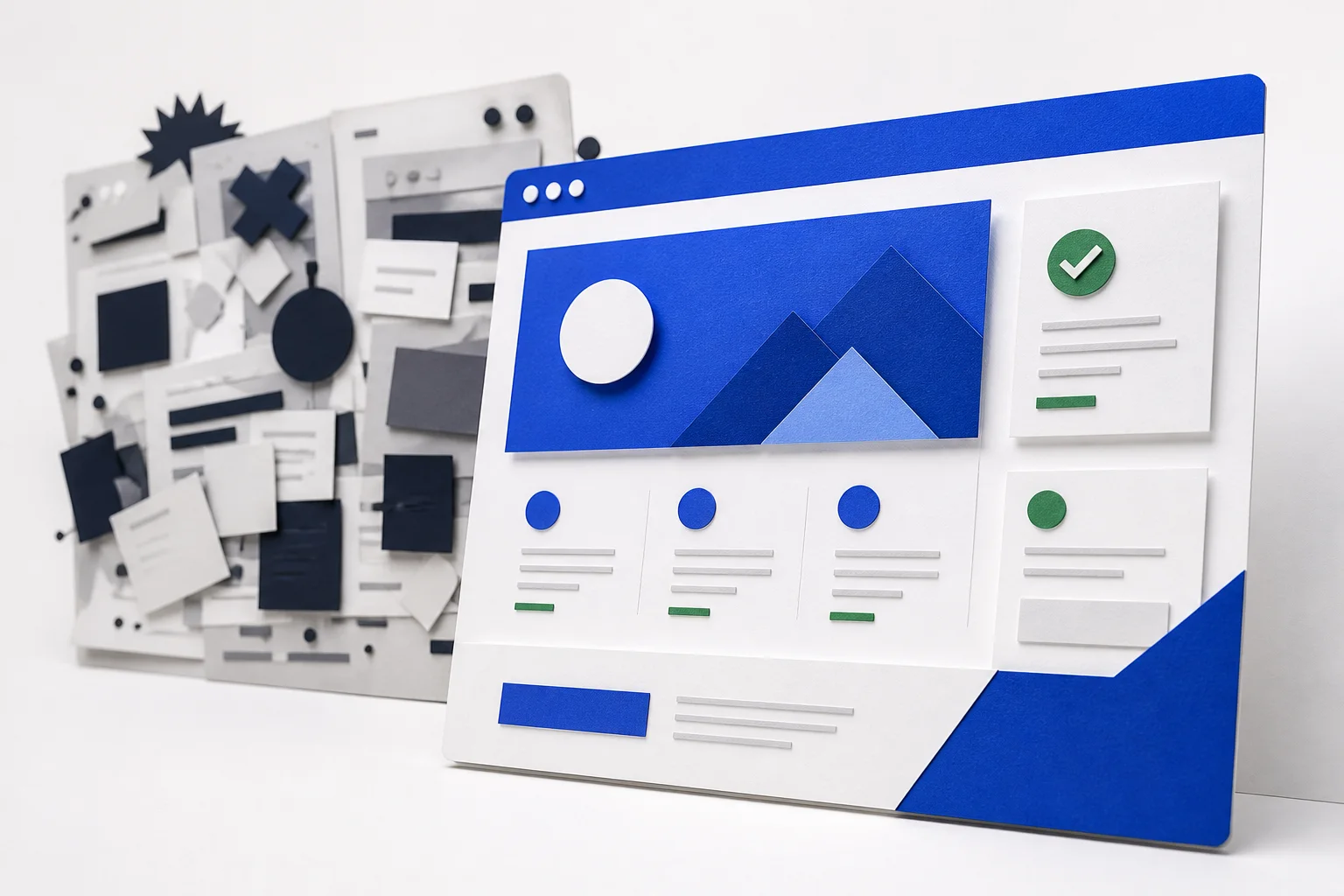
Before someone reads a paragraph, they have already noticed a lot. They have seen whether the page is calm or cluttered, whether the layout feels intentional, whether the navigation is easy to scan and whether the content appears to belong to a business that knows what it is doing. Those impressions arrive fast.
That means design is not just a visual layer sitting on top of the content. It is part of the message. A well-designed page suggests order, competence and care. A messy page suggests friction, uncertainty or unfinished work. People often cannot explain the feeling precisely, but they still react to it.
For a service business, that reaction matters because trust is often the first hurdle. If the website feels trustworthy enough, the visitor keeps reading. If it does not, the copy never gets a fair chance.
If the headline, subheading and call to action are easy to distinguish, the page feels organised. If everything has the same visual weight, the visitor has to work harder to understand what matters.
Generous spacing gives content room to breathe. Tight, crowded sections make even good copy feel heavy. Space is not empty design; it is part of how clarity is delivered.
Type choices influence tone immediately. A readable, consistent typographic system makes the page feel stable. Too many sizes, weights or styles can make the site feel improvised.
When headers, buttons, spacing and content blocks behave the same way from page to page, the site feels more reliable. That consistency tells the visitor there is a system behind the design, not random decisions.
The first screen usually has the highest stakes. It should tell the visitor what the business does, who it is for and what they can do next without making them decode a lot of noise. A strong hero does not need to be huge or flashy. It needs to be obvious.
Images can help when they add confidence, but they can also get in the way if they are too dominant, too abstract or too slow to load. The best hero sections tend to balance clarity with restraint. They make the page feel polished without overpowering the message.
Good hero design is also about reducing doubt. If the page feels precise and calm, the visitor assumes the rest of the site will be just as considered. That assumption is powerful because it sets the tone before the deeper content appears.
You do not always need a full redesign to improve trust. Often the biggest gains come from making the current design clearer. That can mean reducing the number of competing elements in the first viewport, giving headings more room, tightening up the navigation or making the calls to action more obvious.
It can also mean using real content more effectively. A portfolio image, a short testimonial, a service summary or a clear contact point can do more than a decorative block ever will. The point is to use each section for a reason rather than adding sections simply to make the page look full, and the supporting graphic design service can help if the visuals are doing too much or too little.
A page that feels trustworthy does not just look nicer. It usually performs better because the visitor is more willing to stay, read and take the next step. That does not mean every design choice has to be subtle or minimal. It means every choice should support confidence, not distract from it.
When people land on a service site, they are often looking for proof that the business is real, capable and worth contacting. Design can show that proof before the copy is fully read. Clean layout, sensible hierarchy and consistent presentation reduce the mental friction that gets in the way of enquiry.
If the site is trying to persuade people to reach out, the design should make that decision easier, not harder.
The most common problem is overloading the page. Too many blocks, too many effects, too much movement or too many competing messages all make the site feel uncertain. Another problem is inconsistency. When buttons, headings and spacing change style without a reason, the site feels less deliberate.
Weak imagery can also reduce confidence. Stock images that do not fit the business, low-quality screenshots or decorative visuals with no real purpose can make the page feel generic. In contrast, a small number of relevant, well-chosen images usually makes a much stronger impression.
Another issue is burying the important content. If the visitor has to scroll through a lot of explanation before they see what the business does, the page makes trust harder than it needs to be. Clarity near the top is one of the simplest ways to improve credibility.
If the answer to most of those questions is yes, the page is probably helping trust rather than competing with it. That is the level most service sites should aim for.
Clarity usually matters most. If the layout is easy to read, the main message is obvious and the next step is clear, the page feels more trustworthy almost immediately.
Yes. Visitors judge confidence quickly, so layout, spacing, typography and hierarchy can influence whether they continue or leave before they read much.
No. Consistency usually helps more than novelty. A site feels more reliable when the system behind the pages is coherent and easy to understand.